Pukka: 0→1 Mobile Wellness App
Roles: Designer
![]()
![]()
![]()
I led design for a wellness coaching app that brought Ayurveda to western markets, working with Unilever's tea brand Pukka.
• Launched a 0→1 MVP in just 3 months
• 5+ major pivots through native mobile into web app
• Led hyrbid synch / asynch design sprint across 4 time zones
• Drove a 3x increase in tea purchases
Rapid Iteration in Ambiguity
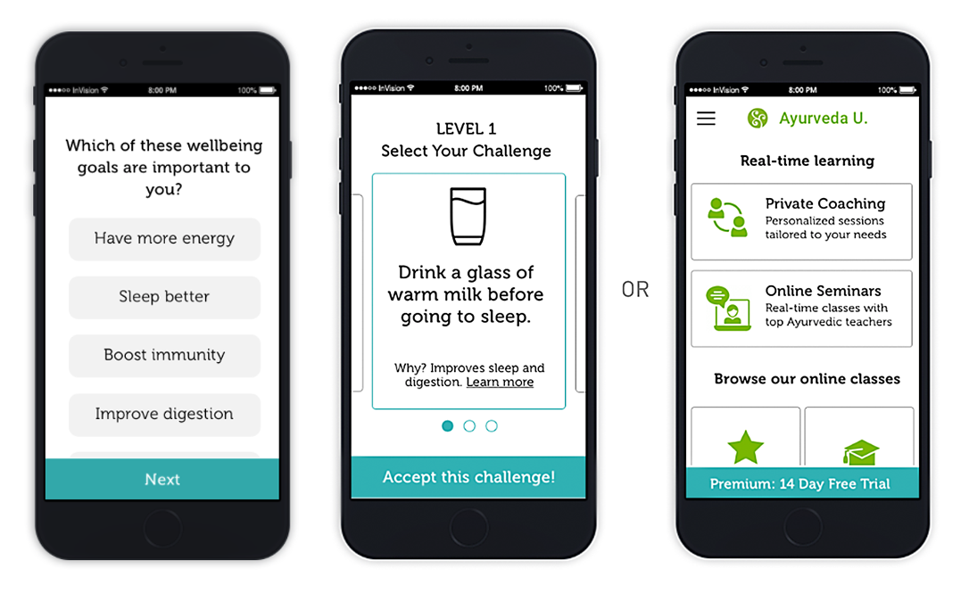
We tested habit tracking, educational courses, coaching, and tea sales. Habit tracking won with users, but the business model didn't work. Coaching showed decent interest with much better economics, so we pivoted hard.
5+ major pivots: Native app → mobile web for speed, habit tracking → coaching marketplace, static forms → guided wizard experience.
![]()
![]()
Mobile-First Design Execution
I designed core flows (registration → Dosha quiz → coach matching → habit tracking → tea purchase) for native mobile then created visual designs inspired by Ayurvedic principles.
For MVP launch, I adapted coach matching to mobile web for faster market validation.
![]()
![]()
Design That Performs
Launch showed 52% wellness satisfaction—4 out of 5 users were confused about Ayurveda despite coaching. I redesigned onboarding with guided wizards, progress visualization, and goal-setting explanations.
Results: 72% wellness satisfaction (exceeding 70% business threshold) and 3x tea purchase increase. Proved that behavioral design drives both wellness outcomes and business growth through authentic human connection.
Argo Insurance: 0→1 InsurTech Quick-Quote Feature
Roles: Designer, Researcher|Read time: 5 mins
![]()
![]()
I led design for a B2B2C insurance quick-quote web app for construction-site insurance that streamlined complex underwriting workflows for specialty insurance products.
• Cross-functional scrum team (PM, eng, design)
•
I reduced underwriter strain from 60% to 5%
• Broker self-service; cut call-ins by 55%
![]()
User Research: B2B SaaS Workflow Analysis
Underwriters were drowning in manual processes while brokers constantly called for quote assistance to customize quotes (60% of quotes).
The VP of Underwriting asked our team to work on this problem, so the PM and I ran user research— interviews and on-site observational, contextual inquiries—to uncover user pains, needs, and behaviors around customization in order to automate underwriters’ manual, time-consuming customizations.
![]()
Cross-Functional Workshops to Define the Problem
I led cross-functional workshops with our engineers, product manager, and business stakeholders to build the insights from user research to a mental model the team could use through object-oriented design. Knowing I had highly technical teammates, I wanted to create familiarity and promote engagement
![]()
“The team exercises Mark led were honestly fun, and they helped my brain slow down to think about the user, which really helped dismantle assumptions I didn't even know I had.“
–Toby Jackson, Lead Engineer
![]()
![]()
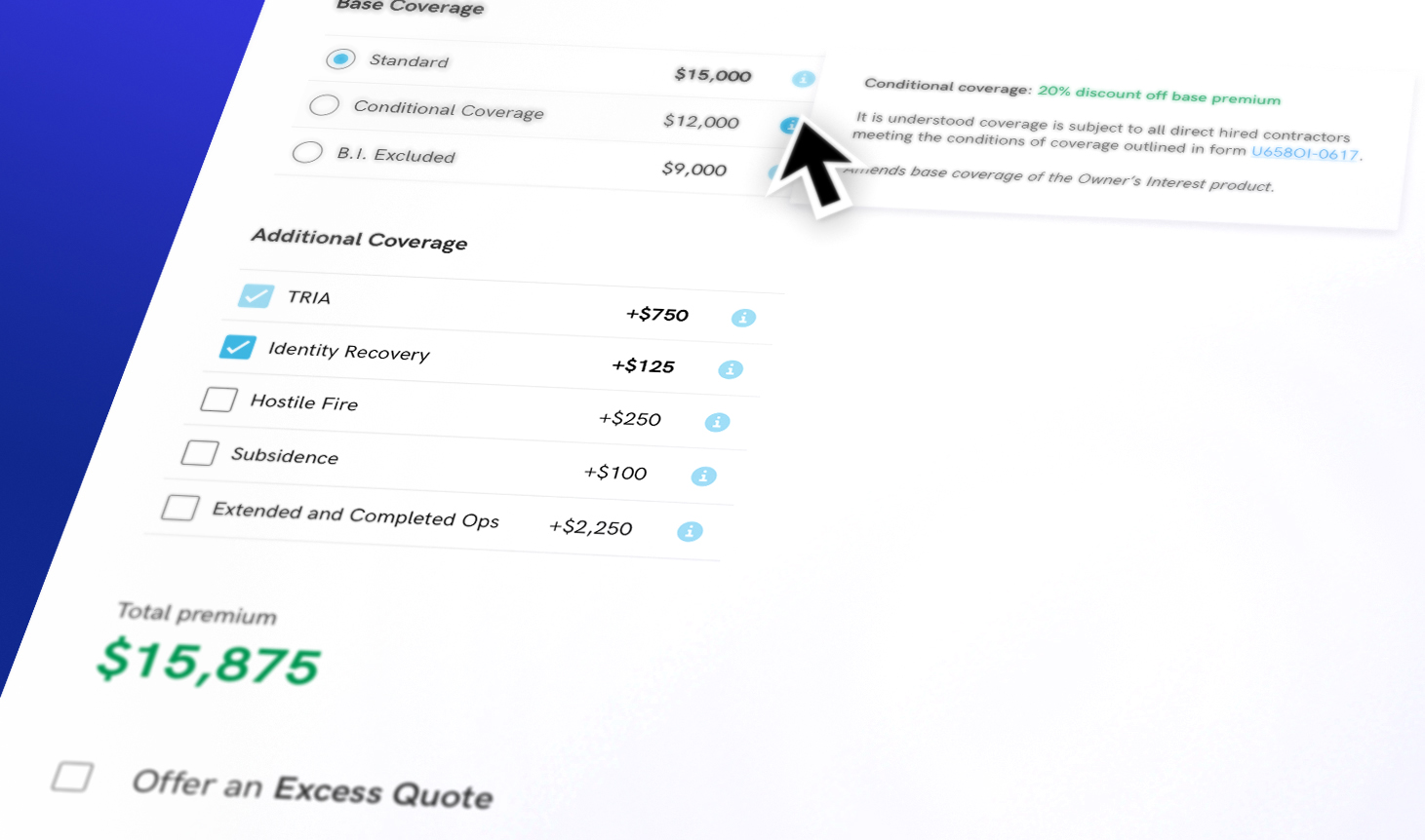
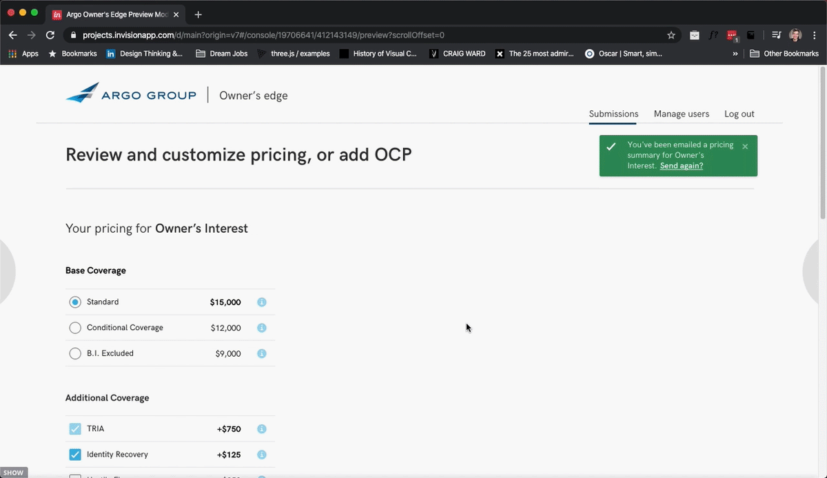
Wireframing the Solution
Working through the complex insurance logic, I created detailed wireframes for the self-service quote customization flow. The key was breaking down what used to require phone calls into digestible, progressive steps that brokers could navigate independently.
Design Systems Collaboration
Since the opportunity came up in wireframing, I spearheaded a notification component redesign project, leading the design system team through gathering use cases and creating scalable patterns. Working with 4 fellow designers, I pulled atomic elements from our UI kit to mock up a full set of notifications that could work across different contexts, including the quick-quote tool. This collaborative approach meant we could move quickly while maintaining consistency across both broker-facing and internal tools.
![]()
![]()
Launch & Impact Measurement
We launched the customization feature over 6 months of iterative design and testing. During that time, we discovered that the progressive disclosure model, while successful for the majority of the design, was causing a down-tick in upsells on a now-hidden component. After adjusting the element to be shown by default, I was able to reverse the downtick.
![]()
Results: Reduced underwriter strain from 60% to 5% post-release while cutting broker call-ins by 55%. This freed underwriters to focus on writing better insurance policies instead of handling routine modifications.
![]()
Shimmer: 0→1 AR iOS Retail App
Roles: Designer|Read time: 5 mins
![]()
![]()
![]()
I joined FlyBy Media, an early-stage computer vision startup as their second design hire to prove our patent-pending image recognition technology through a consumer AR shopping app. I designed 5 core user flows, net-new AR interaction patterns, and in-store navigation features that would validate the tech's real-world reliability. These user experiences ultimately contributed to Apple's acquiring us for our computer vision technology for their first self-driving cars.
![]()
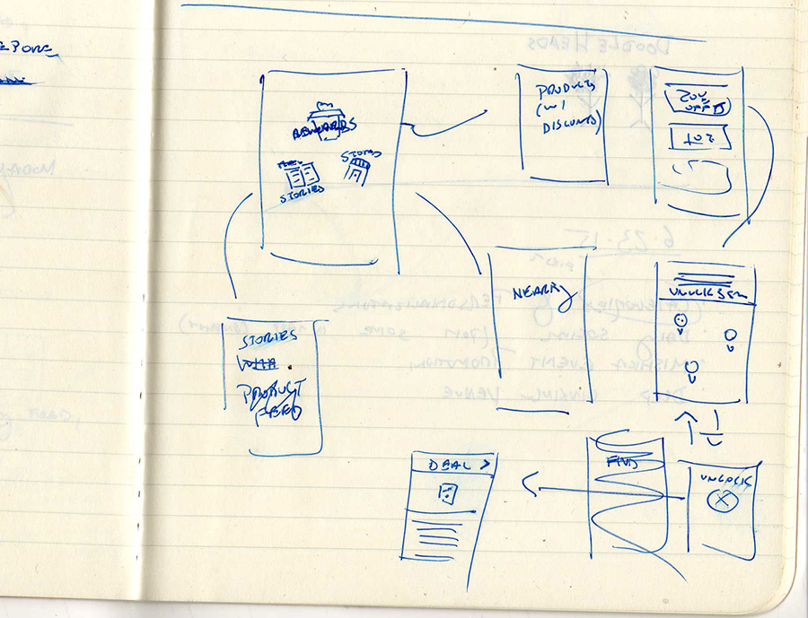
MVP Core Flow: Unlocking Brand Stories by Scanning Products In-Store
After tapping a product in the feed, the user is either shown directions to the store, or if beacon tech determines they are in-store, they are met with an in-store map that helps them find the product. They can then "unlock" the item, allowing them to consume the media/story behind the product.
![]()
![]()
Key Feature: In-Store Navigation & In-App Apple Maps
I partnered with engineers to define requirements for an in-store mapping system that used beacon technology to detect when users entered partner stores. Using Apple Maps as the design basis promoted ease-of-use among our iPhone users—the experience seamlessly integrated with embedded Apple Maps to help you find the store, then switched to our custom map once inside.
Our reps would scan the inside of partnering stores, and the system would load using map elements from the design system I developed. This spatial design work proved our computer vision could handle complex, real-world retail environments beyond simple product recognition.
![]()
Post-Launch Iteration: In-App Rewards for Product Discounts
After launch, we received feedback that indicated users felt a lack of value in the core unlock-flow. I partnered with our sales and marketing team and brainstormed ideas. I proposed that the app provide QR code-based discounts as a reward for using the app to unlock stories. We decided to move forward with that idea.
![]()
![]()
![]()
![]()
Tech Validation & Strategic Impact
Rather than traditional e-commerce conversion metrics, success was measured by engagement data that proved our computer vision technology worked reliably in real-world conditions. High session lengths and product recognition accuracy rates demonstrated the tech was ready for larger applications.
The validation worked—Apple acquired our computer vision technology and integrated it into their self-driving car program. Our consumer app had successfully proven that the underlying technology could handle the complex visual recognition challenges needed for self-driving cars.
![]()
Valon Mortgage: Fintech Startup Founding User Research
Roles: Researcher, Coach|Read time: 2 mins
![]()
I founded the UX Research function at Valon Mortgage, a growth-stage fintech startup, transforming the organization from research-naive to user-centered through systematic process building. Led a team of 5 designers to create foundational research infrastructure that 2x'd research speed, reduced costs 50%, and empowered designers to influence product decisions with evidence-based recommendations.
![]()
Research Strategy & Org Change
When I joined Valon as a designer, I noticed slow speed-to-market was creating opportunity for strategic impact. Partnering with leadership, I identified user research as the biggest organizational need.
I led the design team through a company-wide UX maturity assessment using the Nielsen Norman framework, using a company-wide survey to assess and set a baseline for UX maturity. This baseline revealed gaps in user understanding and gave us a clear vision for building research capabilities from the ground up.
![]()
Measuring the Impact of a New Function
Stepping into the role of founding user researcher, I built comprehensive research foundations: customer journey maps, personas, research repository, research wiki with 20+ reusable templates, and streamlined workflows that cut research costs 50% while increasing speed 25%.
Most importantly, I empowered designers to confidently influence PM partners with evidence-based recommendations in Valon's highly data-driven environment. The follow-up assessment showed the broader team reported increased confidence and user empathy, while designers gained the ability to affect fundamental product decisions using research as evidence.
CNR Investments / Refining Economic Advisory
Join me in analyzing and redesigning an economic advisory tool for CNR Investments. My deep dive into macroeconomics and information architecture optimization led to a successful redesign that drove retention with this key client—and even landed me a job offer from the CEO as a portfolio manager!
![]()
This tool was one used by portoflio managers to communicate the firm’s economic strategy to both new and existing clients. It was a major part of their sales strategy so getting this right was key. Let’s explore the process together.
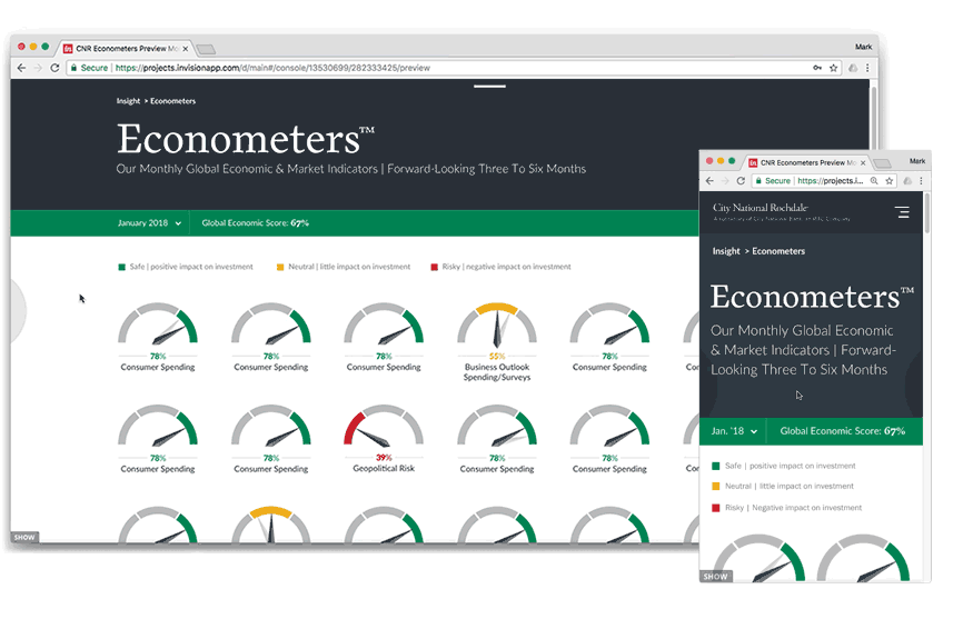
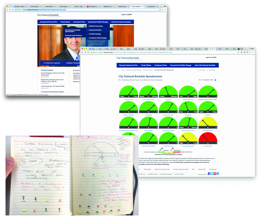
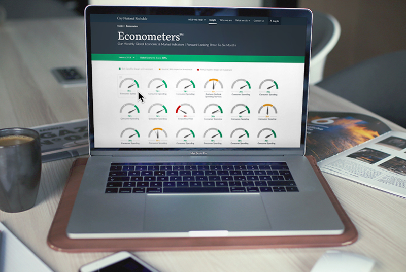
Analysis of the tool today
![]()
The metaphor of speedometer-like gauges arranged in an array offer meaningful connections between the state of an economic marker (e.g. unemployment rate in the US), and what that means for investment (e.g. red = bad, don't invest).
I broke down the information and the design in this way to understand how and what this experience communicated.
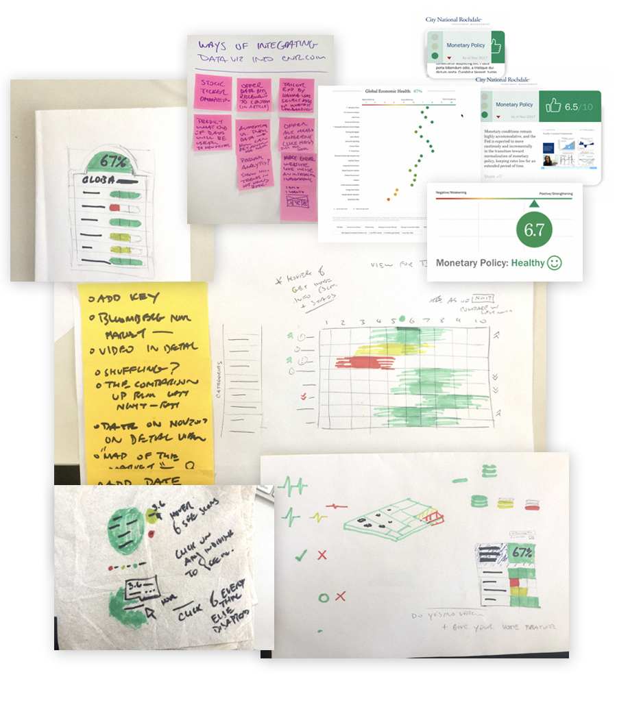
Information architecture optimisation
![]()
To streamline the experience, I arranged all the information into a new hierarchically designed system. By mapping depth and complexity of information to a system of drill-down interactions, I created a new architecture flexible enough to serve a wide range of users.
Economics research, competitive analysis
![]()
Armed with a frame of reference, I looked for ways to make the data immersive. I looked at competitors sites to find examples of interactive infographics, the math behind economic forescasts, as well as sourcing other robust interactive web experiences in general.
I derived customer insights by speaking to Sales and Advisory departments.
Data visualization explorations
![]()
![]()
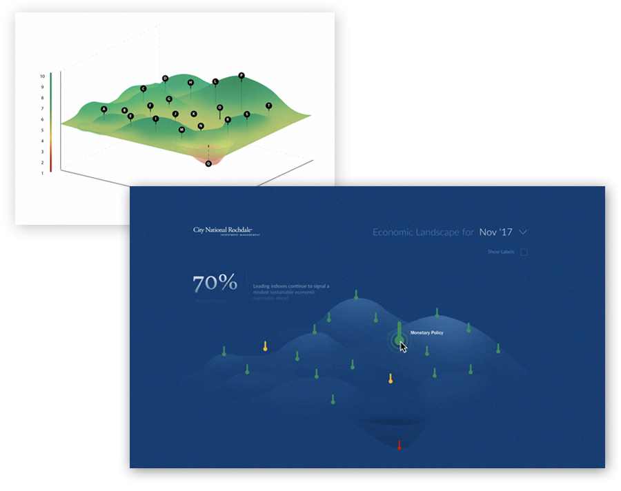
Final result
Although I presented a variety of visualisation metaphors to the client, who decided to stick with the existing metaphor of speedometer, my main recommendation of consolidating and streamlining the information architecture was maintained. Portfolio managers, analysts, and c-suite executives alike were all delighted by the refresh. We won further work with the client, learning that this project helped them drive further acquisition and conversion among their clients. Success!
![]()


