Kena: Bridge of Spirits / Elevating Game UI
“Kena: Bridge of Spirits” is a stunningly beautiful game and one that is near and dear to my heart. Created by the ex-Pixar artists at Ember Labs, I absolutely love this game and so enjoy getting lost in the Shinto-inspired world the creators made.
e.g. Beauty, exhibit A
But while the world & character design is mint, the UI is unfortunately not in the same league. Inconsistent visuals and unclear art direction create a lackluster UI that sticks out like a sore thumb against the simple, natural Zen-like visuals of the rest of the game.
I decided to redesign the UI and in the process discovered an opportunity to push the overall art direction in a way that prioritizes immersion into the natural settings of the game. This is a work in progress and is an ever evolving project.
From the UX to the 3D imagery* itself, I tackle a lot of different disciplines with this project. Join me in exploring how this already gorgeous game can go all the way.
*Midjourney.com and Runway.ml AI image & motion generation tools used to create some 3D scenes
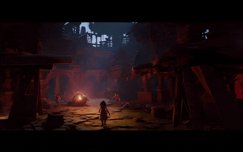
Adding Depth & Drama
While the austere nature of a game that deals with Japanese Shinto spirit guides provides a solid baseline, there’s a missed opportunity for drama and depth. What makes a (good) Pixar film great isn’t just the delightful characters and animation, but the impact of a meaningful story. While Kena certainly has the ingredients, it often plays it too safe. See how I introduce more drama through visuals and more robust storytelling.
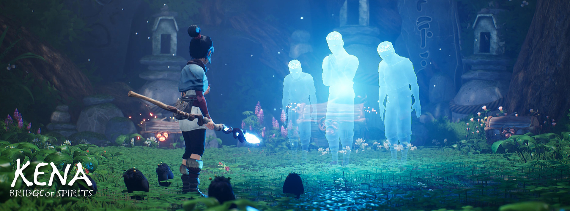
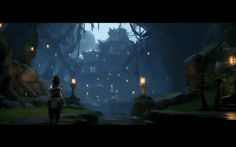
New Early-Game Establishing Sequence

As a way to deepen the connection between the player and the story, I’ve introduced the idea of having more establishing sequences in the early-game to help the player develop a relationship to Kena and the other characters.
Let’s see how we can take that depth and apply it through other aspects of the art direction and visuals.
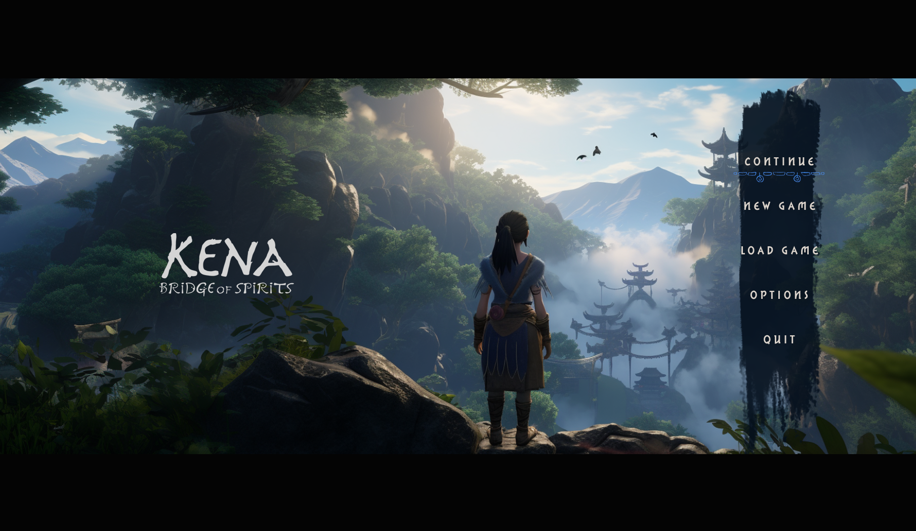
After (Title Screen)
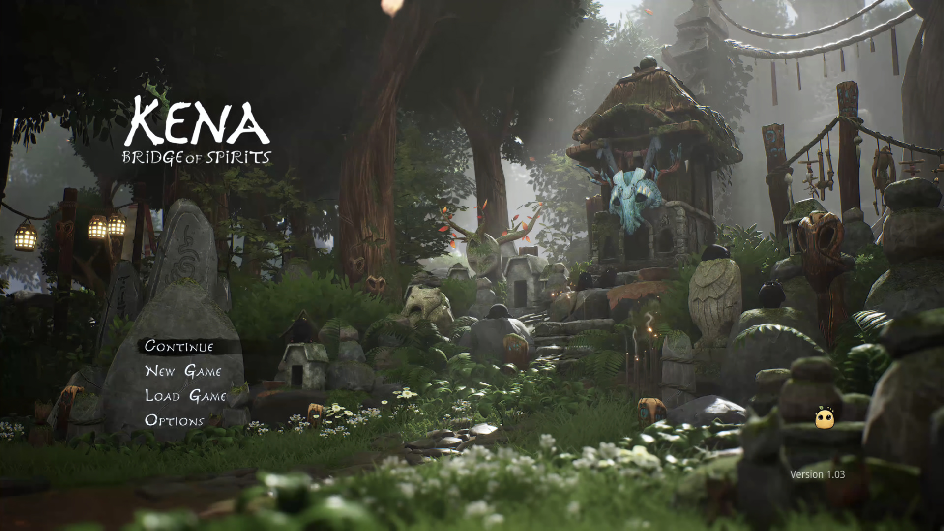
 Before
The previous Title Screen, while quite beautiful and serene, misses the opportunity to showcase the main character. Early in the game’s development, the team was unsure about whether to focus on Kena as the protagonist or rather to focus on the Rot (the cute little round spirits). Remnants of this conflicted direction show up in a few places, the Title Screen being one.
In the redesign, we establish from the get-go the sense of Kena’s epic journey, humble as it may be in tone.
Before (Chapter Screens)


In the original game, milestones and transitions to new chapters tend to go under the radar, when in reality something important had just happened in the players journey. To develop that sense, I chose to lean into the sprawling landscapes and dramatize the somber mysticism already present.
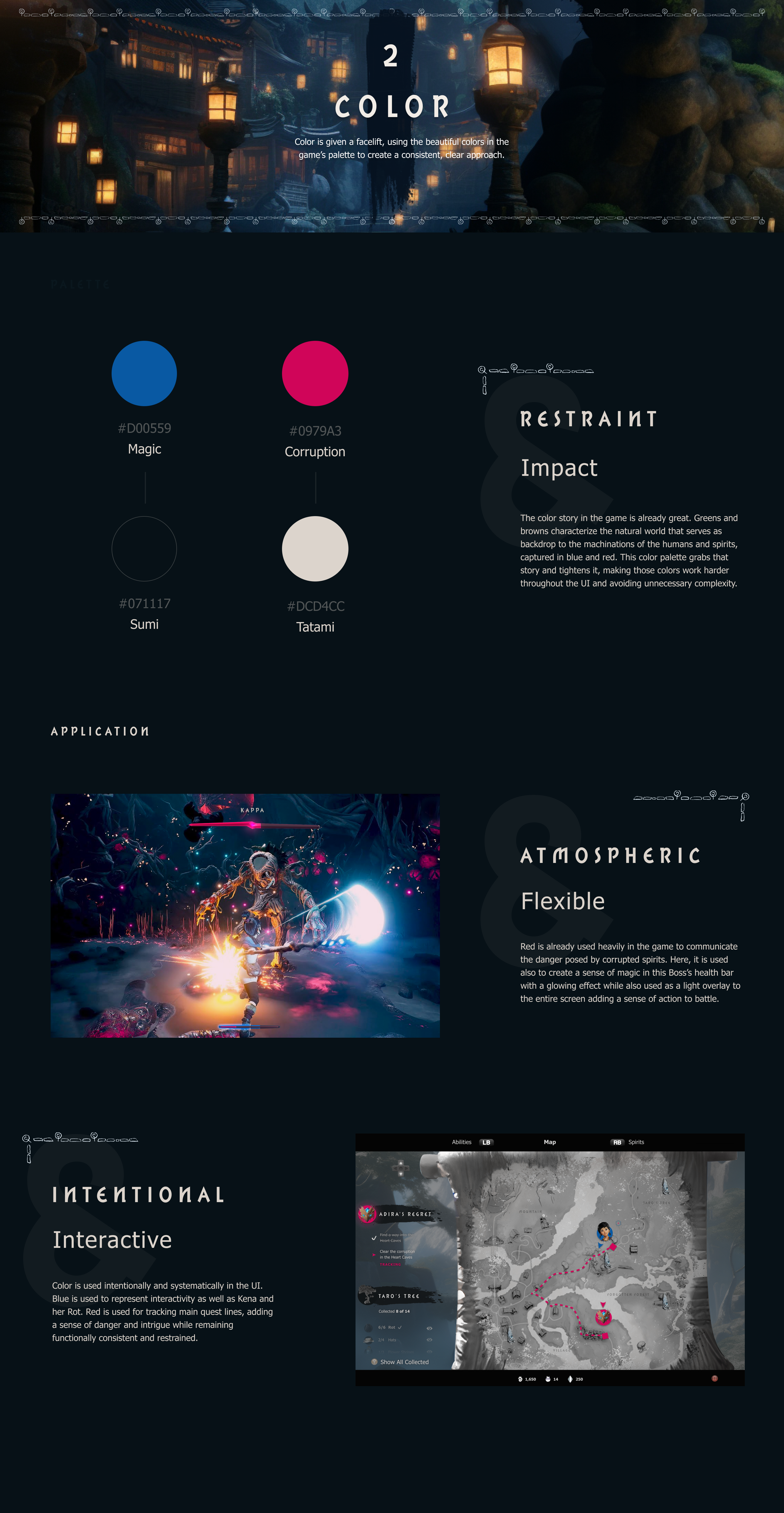
Creating Immersive In-Game UI
The in-game UI, while quite minimal, lacks a clear direction and is often inelegant. The menu, and map, pulls you out of the game into a totally disconnected full-screen UI. This is pretty common practice in games, but as a matter of personal preference I love when everything feels integrated and keeps me as a player immersed.
New Map Transition
In the redesign, Kena pulls the map out of her bag in a quick transition into an map view that maintains environmental context. This emphasizes the sense of exploring in a lost forest, while also highlighting the inappropriateness of opening the map mid-battle.
After (Map, Collectibles Toggled Off & On)

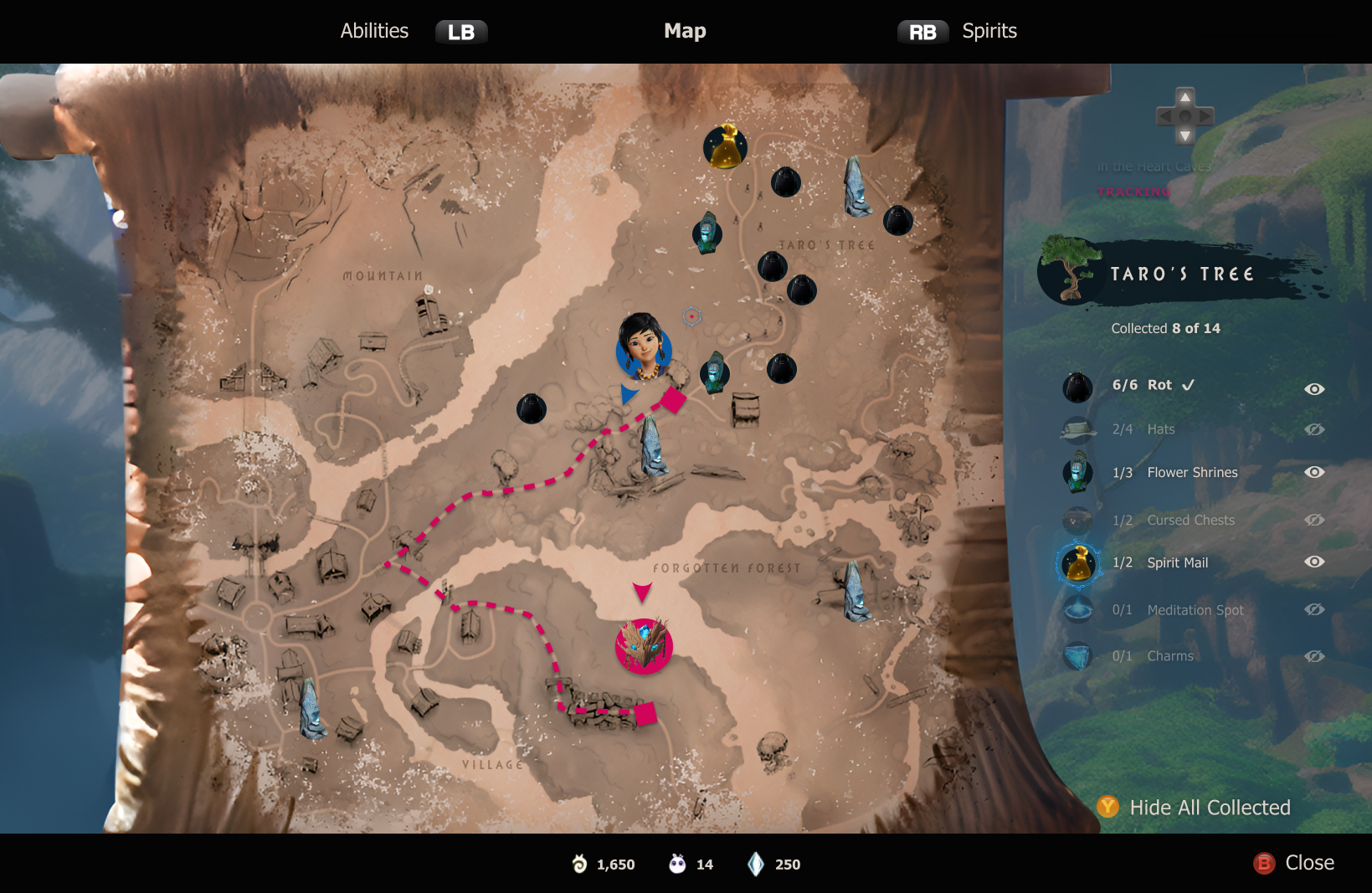

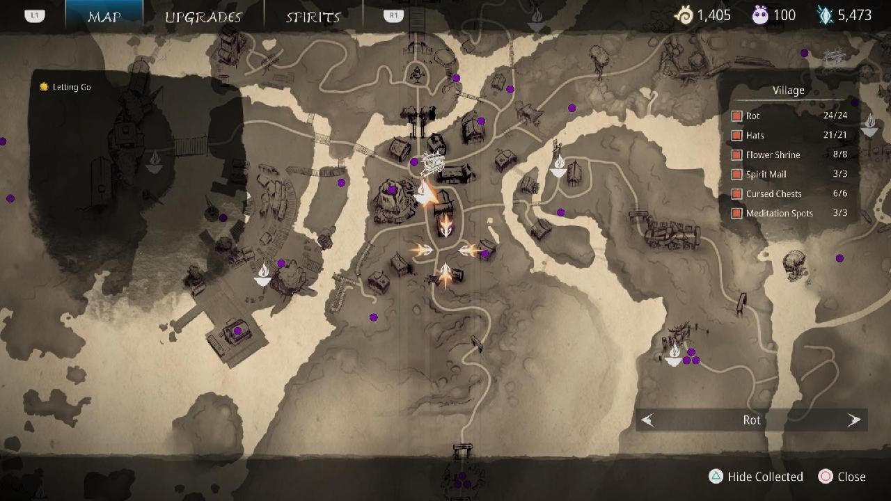
The map itself has also been redesigned to emphasize clarity, with an eye towards priority user actions—firstly, navigation to quest objectives and secondly tracking collectibles. I’ve also reworked the layout and architecture to free up space and put focus back on the map, not on the overlays.
More intuitive navigation means the player can focus on immersion more with each in-game discovery. This extends to battle which has seen a few tweaks to fit better artistically.

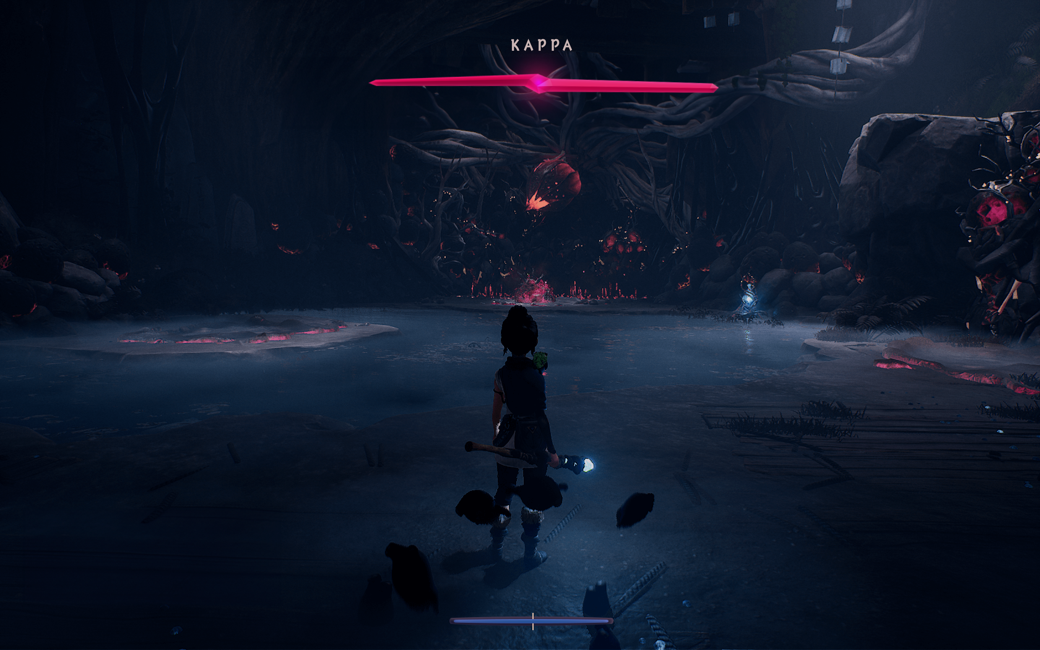

In addition to upgraded visuals for health bars, the ability meter (Rot Actions) has also been integrated into Kena’s health bar. The fan-celebrated UI minimalism is maintained, while effects like a glowing health bar that indicates charged abilities can push the arresting sense of an epic battle replete with swells of intensity.
Original Battle UI


Using the battle health bars as inspiration, I also redesigned the Rot progress bar.
In lieu of experience gained from combat, progress in “Kena: Bridge of Spirits” is rewarded through the accumulation of Rot, culminating in Rot Level Upgrades. Given that the average player will only experience 3 or 4 Rot Level upgrades, the moment should be visually pretty special. However, currently it’s somewhat unceremonious and visually sloppy. In the redesign, Kena’s body glows as the Rot gather around her, a haptic response accompanies a gentle shockwave as the new, stylish UI fades in and announces the upgrade.
Rot Level Progress Bar (After, Before)


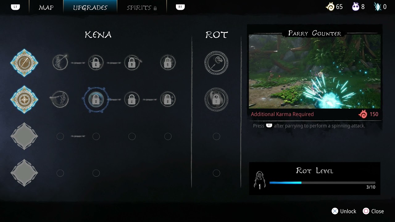
After levleling up and gathering Karma to spend on abilities, upgrading Kena’s powers is a well-earned reward in the gameplay experience. I redesigned that screen as well to bring the UI in line with the new art direction, including placing the screen in the world as a stone tablet Kena quickly pulls out of her bag. The UX is also more streamlined making the icons easier to read and the overall layout cleaner and more intuitive.
After (Default View, Ability Highlight Overlay)


Style Guide